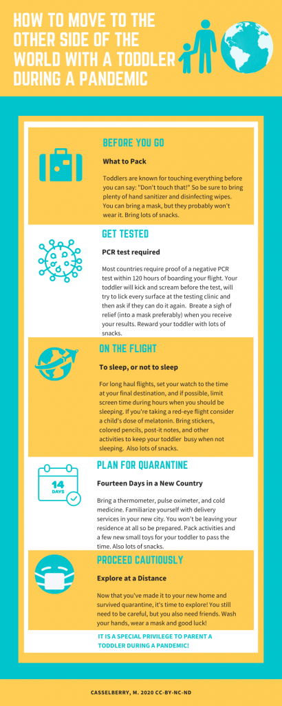
I chose a topic I have recent, relevant experience with. I used a template from Canva and changed around some of the elements and added in yellow blocks to break up each step. I love using canva for communications so it didn’t take long to work with it, but I had challenges limiting the text and being concise. I also wish I had some relevant statistics or numbers to throw in. With a little more research on the topic, that would be attainable. Infographics are fun, but it definitely takes some time and energy to find the right elements that connect with your text. I would encourage students to put as much time into crafting the text as searching for the right images. The images/elements should be clear and obvious and even create an emotional connection to the topic if possible.
Love it! Your design, color scheme, and layout are great! I also enjoy using Canva. They sometimes have too many options and it can feel a bit overwhelming.
Megan,
This looks super professional. I agree with you about not having any numbers, I’m sure there’s not a lot of data available yet. But, infographics need to be informational and you definitely have information and experience. I think a lot of travelers would appreciate this right now.
Your images and streamlined approach create a great humorous take on what is quite a difficult ordeal. I especially liked your use of color which focused rather than detracted from the information.