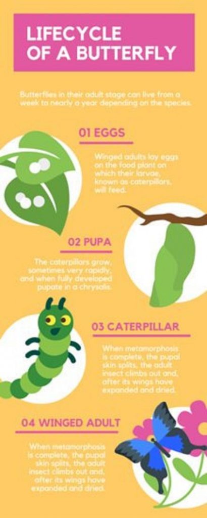
I had a lot of fun exploring infographics! I’m actually surprised I haven’t been introduced to them via my different pieces of training at school. There are so many that I found that I can definitely see myself using during instruction. I picked the one below for that reason. In Second Grade I teach life cycles and this infographic is ideal for that objective.
Exploring the different infographic sites had me a bit overwhelmed, but Canva had the most easy to navigate searches and I really liked the specific link for educators. I did like Piktochart’s charts and maps (specifically I envision using this site for Social Studies) Canva seemed to have the most resources overall. However, I had a lot of trouble getting images from them without paying for a subscription, so this image is from a different site but one of Canva’s templates.
Besides being perfect for classroom instruction, there are a lot of other positives to the infographic above. In his book, Reynolds discusses avoiding clutter when presenting (Reynolds, 2014, p34). This infographic does just that. You do not have to search through images or text because each part is clearly labeled with headings and there are no “extras”. The colors chosen are close to each other on the color wheel, which provides a complementary color scheme that really “works” and is effective in coinciding with the topic of life cycles/nature (Reynolds, 2014, p74). This slide also screams simplicity, which we know is an overall theme of Reynolds (Reynolds, 2014, p18).
As an educator, I really don’t see any negatives to this infographic. It’s simple, it serves the purpose, and just looks good.